实现CSS等分布局
oldbirds 8/3/2023 toolshtml
在我们写界面的时候,会经常碰到此等分布局。
# 案例需求
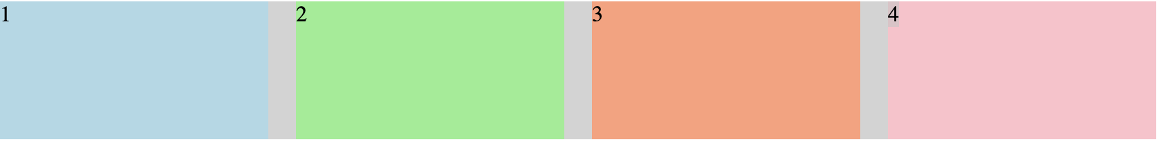
实现如下效果:
在此分享2个比较好的处理方法:
# flex
<style>
.parent{
    display: flex;
}

.child{
    flex: 1;
    height: 100px;
}

.child + .child{
    margin-left: 20px;
}
</style>

<div class="parent" style="background-color: lightgrey;">
    <div class="child" style="background-color: lightblue;">1</div>
    <div class="child" style="background-color: lightgreen;">2</div>
    <div class="child" style="background-color: lightsalmon;">3</div>
    <div class="child" style="background-color: pink;">4</div>
</div>
# grid
<style>
.parent{
    display: grid;
    grid-template-columns:repeat(4,1fr);
    grid-gap:20px;
    height: 100px;
}
</style>

<div class="parent" style="background-color: lightgrey;">
    <div class="child" style="background-color: lightblue;">1</div>
    <div class="child" style="background-color: lightgreen;">2</div>
    <div class="child" style="background-color: lightsalmon;">3</div>
    <div class="child" style="background-color: pink;">4</div>
</div>