ZStack
oldbirds 12/5/2021 swiftiosswiftui
# ZStack
文档:https://developer.apple.com/documentation/swiftui/zstack (opens new window)
子元素会在z 轴方向上叠加,同时在垂直/水平轴上对齐的视图。
ZStack {
    Text("Hello")
        .padding(10)
        .background(Color.red)
        .opacity(0.5)

    Text("OldBirds")
        .foregroundColor(.white)
        .padding(20)
        .background(Color.red)
        .offset(x: 0, y: 40)
}

ZStack 的定义:
@frozen public struct ZStack<Content> : View where Content : View {
    @inlinable public init(alignment: Alignment = .center, @ViewBuilder content: () -> Content)
    public typealias Body = Never
}
ZStack 构造函数的参数说明:
alignment: Alignment, 子视图对齐方式
# Alignment
An alignment in both axes.
它是个结构体,有以下几个静态属性:
- bottom
- bottomLeading
- bottomTrailing
- center
- leading
- top
- topLeading
- topTrailing
- trailing
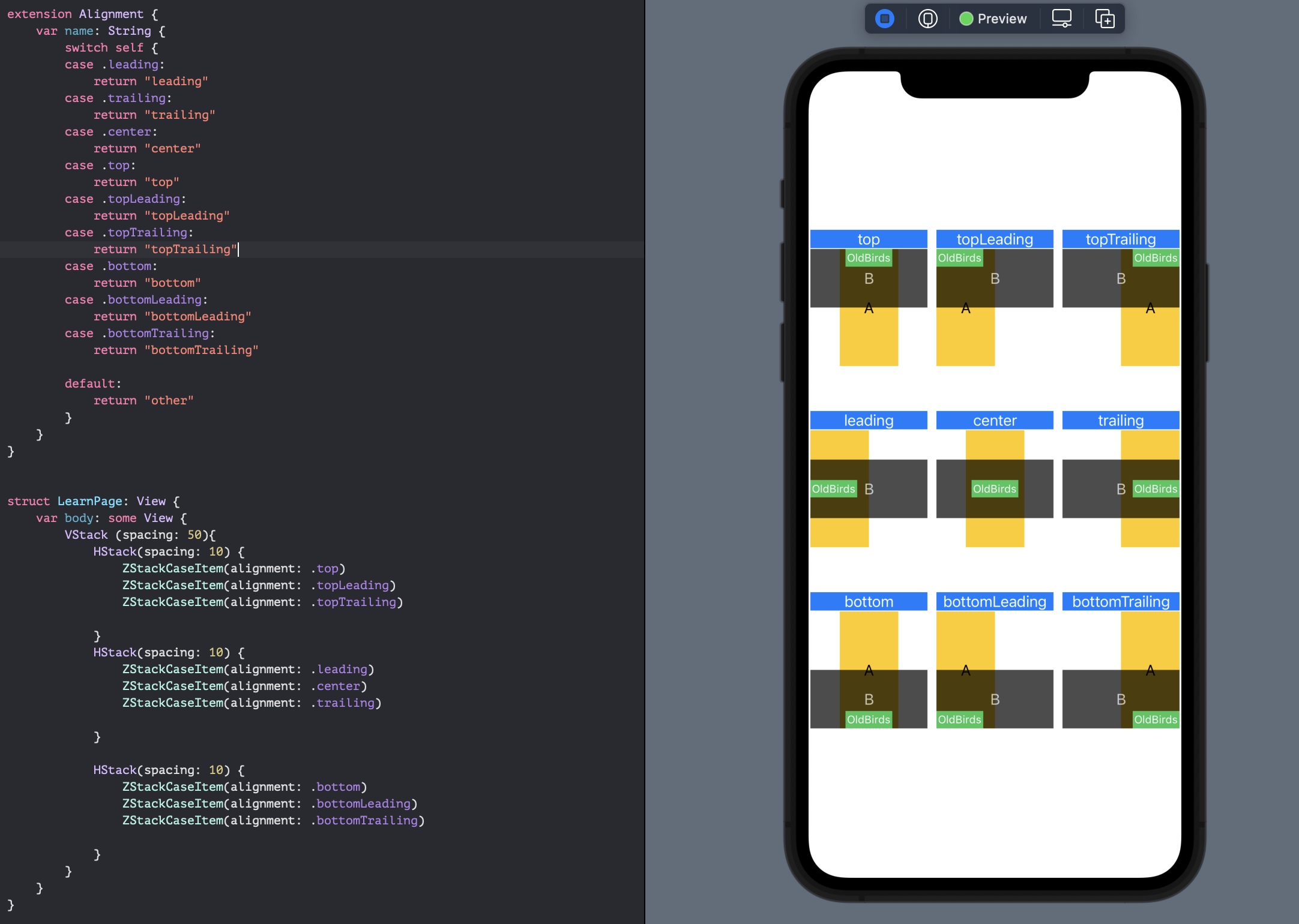
为了更深刻的理解这几种布局差役,首先创建个通用的 ZStackCaseItem, 便于代码复用:
struct ZStackCaseItem: View {
    let alignment: Alignment

    let wh: CGFloat = 65.0

    var body: some View {
        VStack (spacing: 1){
            Text("\(alignment.name)")
                .frame(width: wh * 2)
                .background(Color.blue)
                .foregroundColor(.white)
            ZStack(alignment: alignment){
               Text("A")
                   .frame(width: wh, height: wh * 2)
                   .background(Color.yellow)


               Text("B")
                   .foregroundColor(.white)
                   .frame(width:wh * 2, height: wh)
                   .background(Color.black)
                   .opacity(0.7)

               Text("OldBirds")
                   .font(.system(size: 12))
                   .frame(width: wh * 0.8 , height: wh * 0.3)
                   .background(Color.green)
                   .foregroundColor(.white)

            }
        }
    }
}

extension Alignment {
    var name: String {
        switch self {
        case .leading:
            return "leading"
        case .trailing:
            return "trailing"
        case .center:
            return "center"
        case .top:
            return "top"
        case .topLeading:
            return "topLeading"
        case .topTrailing:
            return "topTrailing"
        case .bottom:
            return "bottom"
        case .bottomLeading:
            return "bottomLeading"
        case .bottomTrailing:
            return "bottomTrailing"

        default:
            return "other"
        }
    }
}
然后分别初始化不同的 alignment:
struct LearnPage: View {
    var body: some View {
        VStack (spacing: 50){
            HStack(spacing: 10) {
                ZStackCaseItem(alignment: .top)
                ZStackCaseItem(alignment: .topLeading)
                ZStackCaseItem(alignment: .topTrailing)

            }
            HStack(spacing: 10) {
                ZStackCaseItem(alignment: .leading)
                ZStackCaseItem(alignment: .center)
                ZStackCaseItem(alignment: .trailing)

            }

            HStack(spacing: 10) {
                ZStackCaseItem(alignment: .bottom)
                ZStackCaseItem(alignment: .bottomLeading)
                ZStackCaseItem(alignment: .bottomTrailing)

            }
        }
    }
}
显示效果:
# 将图像与 ZStack 顶部对齐

那么该如何移动到右上角呢?
struct LearnPage: View {
    var body: some View {
        ZStack (alignment: .topLeading){
            Color.clear
            Image("oldbird-swiftui")
            Text("Hello, World!")
        }
        .background(Color.gray)
    }
}

只需要添加一个子视图Color.clear 即可。那么为什么这样就可以实现?
我们可以将 Color.clear 替换为 Color.blue:

说明 Color.clear 是填充了整个 ZStack 的。这样子视图会其左上角为参考进行对齐。
如果我们指定 Color.blue 的 frame,那么效果会是怎么样的呢?

那么这就容易理解了,为什么添加Color.clear就能实现顶部左对齐的效果了,因为它填充所有可用空间。